Ui
Getting started
Converts an Element msg to an Html msg but does not include the stylesheet.
You'll need to include it manually yourself
Basic Elements
The basic building block of your layout.
howdy : Element msg
howdy =
    Ui.el [] (Ui.text "Howdy!")
When you want to render exactly nothing.
Create some plain text.
text "Hello, you stylish developer!"
The basic building block of your layout.
You can think of an el as a div, but it can only have one child.
If you want multiple children, you'll need to use something like row or column
import Ui

myElement : Ui.Element msg
myElement =
    Ui.el
        [ Ui.background (Ui.rgb 0 125 0)
        , Ui.borderColor (Ui.rgb 0 178 0)
        ]
        (Ui.text "You've made a stylish element!")
Rows and Columns
When we want more than one child on an element, we want to be specific about how they will be laid out.
So, the common ways to do that would be row and column.
Attributes
Size
An attribute that can be attached to an Element
Fill the available space. The available space will be split evenly between elements that have width fill.
Sometimes you may not want to split available space evenly. In this case you can use portion to define which elements should have what portion of the available space.
So, two elements, one with width (portion 2) and one with width (portion 3). The first would get 2 portions of the available space, while the second would get 3.
Also: fill == portion 1
Debugging
Highlight the borders of an element and it's children below. This can really help if you're running into some issue with your layout!
Note This attribute needs to be handed Debug.todo in order to work, even though it won't do anything with it. This is a safety measure so you don't accidently ship code with explain in it, as Elm won't compile with --optimize if you still have a Debug statement in your code.
el
    [ Ui.explain Debug.todo
    ]
    (text "Help, I'm being debugged!")
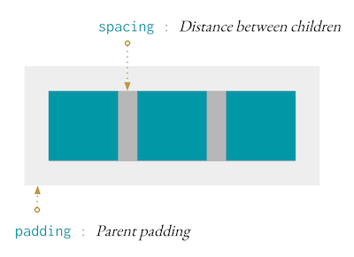
Padding and Spacing
There's no concept of margin in elm-ui, instead we have padding and spacing.
Padding is the distance between the outer edge and the content, and spacing is the space between children.
So, if we have the following row, with some padding and spacing.
Ui.row [ padding 10, spacing 7 ]
    [ Ui.el [] Ui.none
    , Ui.el [] Ui.none
    , Ui.el [] Ui.none
    ]
Here's what we can expect:
Note spacing set on a paragraph, will set the pixel spacing between lines.
In the majority of cases you'll just need to use spacing, which will work as intended.
However for some layouts, like Ui.Prose.column, you may want to set a different spacing for the x axis compared to the y axis.
Alignment
Alignment can be used to align an Element within another Element.
Ui.el [ Ui.centerX, Ui.alignTop ]
    (Ui.text "I'm centered and aligned top!")
If alignment is set on elements in a layout such as a row, then the element will push the other elements in that direction. Here's an example.
Ui.row []
    [ Ui.el [] Ui.none
    , Ui.el [ Ui.alignLeft ] Ui.none
    , Ui.el [ Ui.centerX ] Ui.none
    , Ui.el [ Ui.alignRight ] Ui.none
    ]
will result in a layout like
|-|-| |-| |-|
Where there are two elements on the left, one on the right, and one in the center of the space between the elements on the left and right.
Note For text alignment, check out Ui.Font!
Content Alignment
Transparency
Borders
A record that is used to set padding or border widths individually.
Ui.paddingWith
    { top = 10
    , right = 20
    , bottom = 30
    , left = 40
    }
You can also use Edges as a constructor. So, the above is the same as this:
Ui.paddingWith (Ui.Edges 10 20 30 40)
Where the numbers start at the top and proceed clockwise.
Backgrounds
Cursors
Set the cursor to be a pointing hand when it's hovering over this Ui.
Adjustment
Viewports
For scrolling element, we're going to borrow some terminology from 3D graphics just like the Elm Browser package does.
Essentially a scrollable is the window that you're looking through. If the content is larger than the scrollable, then scrollbars will appear.
Clip the content if it overflows.
Similar to scrollable, this element will fill the space it's given.
If the content overflows this element, it will be clipped.
Links
el
    [ link "http://fruits.com" ]
    (text "A link to my favorite fruit provider.")
A link to download a file.
A link to download a file where you can supply a filename you would like the file downloaded as.
Images
Both a source and a description are required for images.
The description is used for people using screen readers.
Leaving the description blank will cause the image to be ignored by assistive technology. This can make sense for images that are purely decorative and add no additional information.
So, take a moment to describe your image as you would to someone who has a harder time seeing.
Ui.image []
    { source = "https://example.com/image.jpg"
    , description = "A picture of my cat looking goofy."
    }
For images that you don't control, it can be useful to wire it up in a way so you don't get the "image missing" icon if it fails to load.
This is really common for user portraits.
Note You'll likely need to set the height and width of the element
Ui.imageWithFallback
    [ width (Ui.px 200)
    , height (Ui.px 200)
    ]
    { source = "https://example.com/image.jpg"
    , fallback = Ui.text "Image failed to load"
    }
Color
In order to use attributes like Font.color and Background.color, you'll need to make some colors!
Provide the red, green, and blue channels for the color.
Each channel takes a value between 0 and 255.
Nearby Elements
Let's say we want a dropdown menu. Essentially we want to say: put this element below this other element, but don't affect the layout when you do.
Ui.row []
    [ Ui.el
        [ Ui.below (Ui.text "I'm below!")
        ]
        (Ui.text "I'm normal!")
    ]
This will result in /--------------- |- I'm normal! -| ---------------/ I'm below
Where "I'm Below" doesn't change the size of Ui.row.
This is very useful for things like dropdown menus or tooltips.
This will place an element in front of another.
Note: If you use this on a layout element, it will place the element as fixed to the scrollable which can be useful for modals and overlays.
This will place an element between the background and the content of an Ui.
This is your top level node where you can turn
ElementintoHtml.